

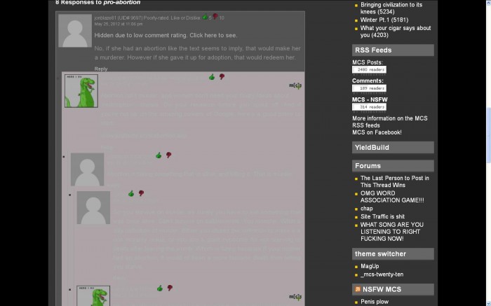
Screen capture of the comment section.
I like the layout shift, with the exception of some of the back ground colors.
Serious Tiki? Are you trying to make us blind?
Discuss.
Screen capture of the comment section.
I like the layout shift, with the exception of some of the back ground colors.
Serious Tiki? Are you trying to make us blind?
Discuss.


This is the first I’m hearing about it.
Do me a Favor, Rate this comment very high.
let’s see what happens to this one as well.
also: i call bullshit. submitted similar pic last week which you rejected.
Please rating this comment very low.
I will reply to this low-rated comment to see what happens.
you’ve turned green, for the moment at least, due to you being 3up and 5down, which means the comment is “hotly debated”, which I totally forgot about when I was going about the code and mucking it all up.
NOT OPPOSITE DAY
whatever, I went back to the post in the post picture thumbnail media image and tested it from there.
things are greener now.
also the number of thumbs don’t appear on the old lay out
[img]http://www.imageleech.net/data/media/1/mcs_shit.jpg[/img]
That’s what I thought at first (I’m still in the old layout solely because of drop down comments). If you highlight the text over the votes, you can see the number. The font color next to the icons are white in this template, over a white background.
one of those issues that if I fix it here, it breaks there and vice versa. I could fix it by giving the old theme a background for the vote number, but golly that’s a lot of work.
I like the old layout for personal reasons that are none of your damn business. Highlighting text has never been a big issue for me. It is like a magical surprise to find out if my thoughts are shared by a pseudo democratic majority or if I am thinking like a total douche. Also, drop down comments.
Am I in the twilight zone?
Yes.
“new theme is clearly superior”
Superior eye-fuck 😀