The pacing, framing, and dialogue are pretty terrible, as well.
It’s not really a shame that it’s so terrible. It’s sort of like watching a retarded child playing basketball. It’s funny because it’s so terrible, but you can’t laugh because of a mixture of pity and disgust.
I’ve seen worse art for sure. The close ups are really kinda good. It’s the story. I have no idea what’s going on. You would be better off concentrating on writing the story, and draw an occasional panel to accent when something interesting is happening. Just a thought.
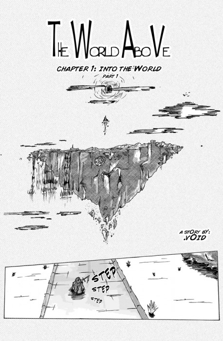
Front page:
The clouds on the sun look like a front-on plane until you look straight at it. I actually thought it was till i noticed the sun on the page2 and thought “hey, that plane looks weird as fuck. Wait, what the–”
First page:
Who the hell would ever think it was a good idea to build a security hut so far back from: a) the road and b) the gates; not to mention leaving the gates wiiiiide open. Kinda defeats the purpose dontcha think?
Also “tha” is spelled “the”.
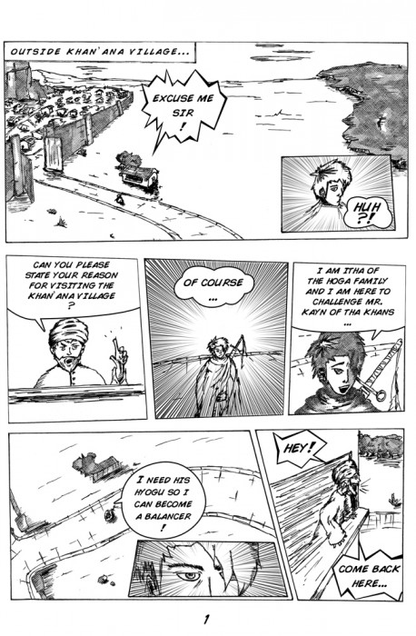
Page 2:
Perspective on the streets WAY FUCKING OFF
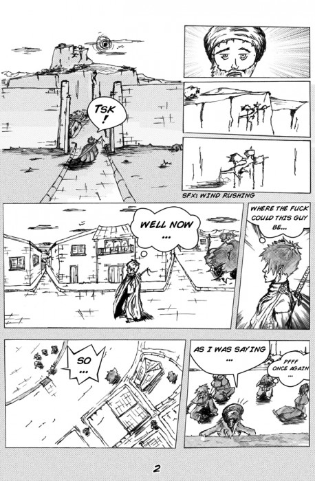
Page 3:
Did someone stretch that guy out like Mike Teavee? Seriously, what’s with that stomach?
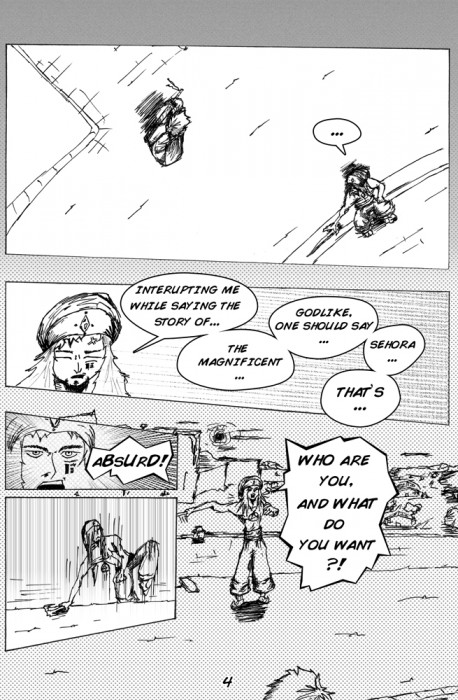
Page 4:
HOLY SHIT THAT GUY’S ARM IS MUTATING!!
All of it:
Really, WTF? You might have a good story in your head but what’s on paper makes me laugh, and not in a good way. Also, I think you wrote half of that in Swahili… seriously, no sense whatsoever.
Good luck. Hope to see some revisions soon. Tomorrow OK?
Also, take Life Drawing classes at your local community college. They’re fun, you get to draw naked girls, you learn a great deal, and the classes are cheap. Your skill will improve incredibly, you just need to learn to avoid some of the classic mistakes you’re making.
I’m not sure why you keep posting this stuff. This is very seriously to the place to post your work if you’ve got a thin skin. I suggest DeviantArt. This place is full of snark and sarcasm. <3


is there a point to this?
It’s too bad that the art’s terrible.
The pacing, framing, and dialogue are pretty terrible, as well.
It’s not really a shame that it’s so terrible. It’s sort of like watching a retarded child playing basketball. It’s funny because it’s so terrible, but you can’t laugh because of a mixture of pity and disgust.
In desperate need of a good storytelling techniques.
www.eldrbarry.net/roos/eest.htm
www.cloudscapecomics.com/2011/07/06/an-introduction-to-graphic-novels/
www.cloudscapecomics.com/comics-101/from-start-to-finish/
www.cloudscapecomics.com/2011/06/25/where-do-you-get-your-ideas/
www.sfwa.org/2011/07/guest-post-60-rules-for-short-sf-and-fantasy/
Try that.
too late
Needs more speed lines.
Needs more ellipses.
I’ve seen worse art for sure. The close ups are really kinda good. It’s the story. I have no idea what’s going on. You would be better off concentrating on writing the story, and draw an occasional panel to accent when something interesting is happening. Just a thought.
OK few tips:
Front page:
The clouds on the sun look like a front-on plane until you look straight at it. I actually thought it was till i noticed the sun on the page2 and thought “hey, that plane looks weird as fuck. Wait, what the–”
First page:
Who the hell would ever think it was a good idea to build a security hut so far back from: a) the road and b) the gates; not to mention leaving the gates wiiiiide open. Kinda defeats the purpose dontcha think?
Also “tha” is spelled “the”.
Page 2:
Perspective on the streets WAY FUCKING OFF
Page 3:
Did someone stretch that guy out like Mike Teavee? Seriously, what’s with that stomach?
Page 4:
HOLY SHIT THAT GUY’S ARM IS MUTATING!!
All of it:
Really, WTF? You might have a good story in your head but what’s on paper makes me laugh, and not in a good way. Also, I think you wrote half of that in Swahili… seriously, no sense whatsoever.
Good luck. Hope to see some revisions soon. Tomorrow OK?
Also: thickness of lines need to vary. don’t have all the lines the same depth.
Also, take Life Drawing classes at your local community college. They’re fun, you get to draw naked girls, you learn a great deal, and the classes are cheap. Your skill will improve incredibly, you just need to learn to avoid some of the classic mistakes you’re making.
I’m not sure why you keep posting this stuff. This is very seriously to the place to post your work if you’ve got a thin skin. I suggest DeviantArt. This place is full of snark and sarcasm. <3
erm.. *not* the place.