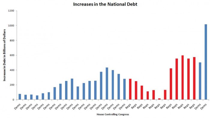
Same numbers as the earlier post except colored by majority party in congress. Now stop bickering, compare the two, and then try to draw your conclusions. 🙂
For comparison:


Same numbers as the earlier post except colored by majority party in congress. Now stop bickering, compare the two, and then try to draw your conclusions. 🙂
For comparison:


Republicans & Democrats are both corrupt. Your argument is invalid.
What year does this start and end at?
This.
Funny how the years aren’t labeled.
The problem with graphs like this( and the previous one) is that they over simplify the argument to lay blame on a a particular party.
The bottom line is partisan politics makes us all hypocrites and liars.
Laying blame is the core value of American politics
Woo, single party communism!
Do wut now?