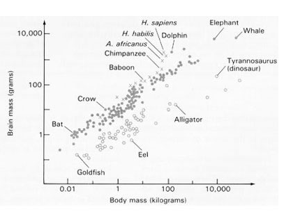
I think the idea is to compare brain mass to body mass of various members of the animal kingdom. You can see that the apes and humans have the largest brain masses for their overall body mass.
What’s also interesting, though it does not show this explicitly, is that you can also see how brain mass affects intelligence. You’ll notice some of the most intelligent creatures are at the top of the scale, like apes, humans, dolphins, etc.


heh… goldfish are dum.
This doesn’t make much sense…everthing is just going in a slanted line…it’s basically telling us that brains are smaller then the size of something.
I think the idea is to compare brain mass to body mass of various members of the animal kingdom. You can see that the apes and humans have the largest brain masses for their overall body mass.
What’s also interesting, though it does not show this explicitly, is that you can also see how brain mass affects intelligence. You’ll notice some of the most intelligent creatures are at the top of the scale, like apes, humans, dolphins, etc.